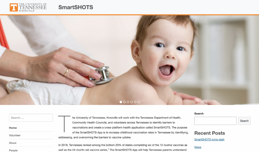
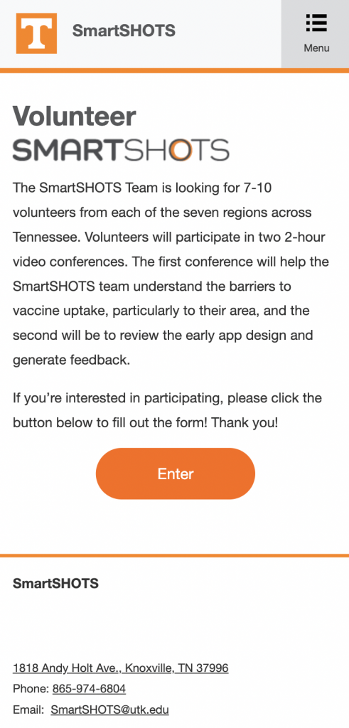
As a part of the process of recruiting volunteers to participate, as well as for brand recognition and identifiability, the Design and Engineering teams built a logo and website for the SmartSHOTS program.

The design team created the logo. It went through multiple rounds of review and comment by the team and was designed to reflect the SHOTS survey from which the project takes its name. The word ‘Smart’ is also capitalized in the logo to soften the emphasis on the shot portion of immunization, allowing the project to be easily identifiable and recognizable, and to go on to providing valuable information about the benefits of immunization and resources to allow access to them. The dynamic nature of the logo suggests movement and change. The final goal of the project is for the management of the app to be taken over by the Tennessee Department of Health and to continue to serve as an up-to-date source of information for all Tennesseans.

The SmartSHOTS website was built by the Engineering team with support and input from Design, Nursing, and the team’s linguistics consultant. It is the public-facing platform for the project until the app is completed and serves both informational and practical purposes. Informationally, it has details about the project’s goals, its team, the status of the project, and any newsworthy updates. The website also features a mobile version, which allows for ease of access and navigation from any mobile device. Practically, it is also a place where volunteers who want to help the SmartSHOTS team identify barriers to immunization can go to sign up.
